Email Design Best Practices: How to Make Your Emails Look Professional

Introduction: Why Email Design Can Make or Break Your Campaign
I’ll be honest - when I first started sending marketing emails, I didn’t give design much thought. I figured if the words were strong, people would read. But the reality? My emails looked clunky, unprofessional, and sometimes even broke on mobile. The result: low open rates, even lower clicks, and unsubscribes that stung.
Then I realized something: design is not just decoration. It’s how you guide attention, build trust, and make your message irresistible. In fact, studies show that 81% of people delete an email if it appears poorly on mobile devices. And another report reveals that 38% of users stop engaging with content if the layout or visuals are unattractive.
So, in this post, I’ll walk you through email design best practices that make your campaigns look polished, professional, and high-converting. I’ll also share examples, real stats, and comparisons of popular tools like Seamailer, Mailchimp, ConvertKit, and Canva to help you decide what works best.
Why Email Design Matters
Think about your own inbox. Which emails grab your attention? The plain, text-heavy ones that look like a wall of words? Or the ones with clear headers, appealing visuals, and buttons that make it easy to take action?
Professional design builds trust. If your email looks sloppy, people assume your product or brand might be too. Good design also drives engagement: when the layout flows naturally, readers stay longer and are more likely to click.
- Your email’s look matters just as much as its message. In fact, branded and professionally designed emails can boost conversions by up to 200% compared to plain, poorly designed ones.
- And it doesn’t stop there — emails that include visuals see a 42% higher click-through rate than text-only messages. A strong design not only captures attention but also builds trust and encourages action.
When your emails look as good as they sound, your audience takes notice — and clicks.
Design is not optional - it’s a conversion lever.
Key Elements of Professional Email Design
1. Mobile Responsiveness
With over 60% of emails opened on mobile devices (Litmus), your design must look flawless on smaller screens.
- Use single-column layouts to ensure readability and prevent awkward text wrapping.
- Keep subject lines and preheaders short and punchy so they display fully on mobile inboxes.
- Test your emails on both iOS and Android devices to catch any formatting or rendering issues before sending.
A mobile-friendly email isn’t just good design — it’s the difference between being opened and being ignored.

2. Layout & Structure
Think of your email as a mini landing page — every element should guide the reader’s eye and encourage action.
- Start strong: Begin with a clear header or your brand logo to establish identity immediately.
- Keep it organized: Break content into clean sections with adequate spacing for easy scanning.
- Guide attention: Apply visual hierarchy using headings, subheadings, and concise body text to make information flow naturally.
A well-structured email keeps readers engaged — and makes your message impossible to miss.
3. Typography
Fonts can make or break the professionalism of your emails. The right typography keeps your message clear, polished, and easy to read.
- Stick to web-safe fonts like Arial, Helvetica, or Georgia to ensure consistent display across all devices and inboxes.
- Keep body text between 14–16px for optimal readability without overwhelming the reader.
- Use bold sparingly to highlight key points or CTAs — overusing it can dilute emphasis and make content look cluttered.
Clean, readable typography not only improves engagement but also strengthens your brand’s credibility.
4. Color Psychology
Colors do more than decorate your emails — they shape how your audience feels and responds. Choosing the right palette can strengthen your brand identity and drive action.
- Blue conveys trust and reliability, making it a favorite among SaaS and tech brands.
- Green represents growth, balance, and eco-friendliness, often used by sustainable or wellness-focused businesses.
- Red signals urgency and excitement, perfect for limited-time offers or calls to action.
- Above all, maintain brand consistency — using the same color scheme across campaigns builds recognition and reinforces your visual identity.
The right colors don’t just catch the eye — they connect emotionally and inspire clicks.

5. Images & Visuals
Images can instantly capture attention — but only if they’re chosen and used wisely. The right visuals enhance your content, while poor ones can distract or slow down your email.
- Use high-quality, optimized images to ensure fast loading across all devices and inboxes.
- Avoid overused or artificial stock photos — authenticity builds trust and connection.
- Include descriptive alt text so your message remains clear even if images fail to load, and to support accessibility for all readers.
Thoughtful visuals make your emails more engaging, professional, and memorable — without compromising performance.
6. Calls-to-Action (CTAs)
Your email is only as strong as its call-to-action (CTA) — it’s the moment that turns interest into action.
- Use buttons instead of plain hyperlinks to make your CTA stand out and invite clicks.
- Choose contrasting colors so your button pops against the background and draws the eye immediately.
- Write action-driven copy like “Start My Free Trial” or “Get My Discount” to create urgency and excitement.
A well-designed CTA doesn’t just ask — it inspires your reader to take the next step.
7. White Space
Clutter kills — it overwhelms readers and buries your message. White space, on the other hand, enhances readability, gives your design room to breathe, and naturally guides attention to what matters most.
A clean layout isn’t empty — it’s intentional. Let your content and visuals shine by giving them space to speak.
My “Ugly Email” Lesson
A few years ago, I launched a campaign announcing a new product — and I made every rookie mistake in the book. I crammed everything into one email: tiny fonts, too many colors, and images that refused to load. The result looked more like a patchwork quilt gone wrong than a professional announcement.
The outcome?
- 12% lower open rate than average.
- 35% drop in click rate.
- Several unsubscribes, with feedback calling the email “untrustworthy.”
That campaign taught me a hard truth: design directly affects credibility.
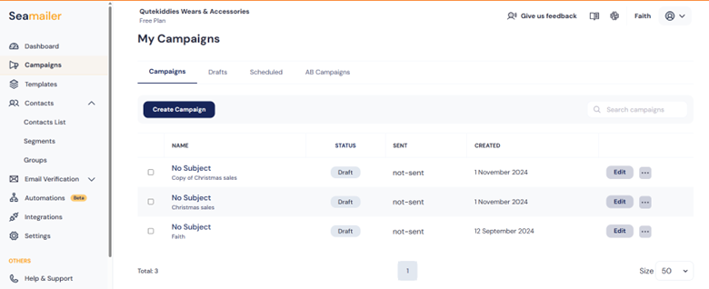
For the next campaign, I stripped everything back — using Seamailer’s drag-and-drop builder to create clean sections, consistent branding, and one clear CTA. The difference was night and day: the email looked professional, felt trustworthy, and conversions doubled.
Sometimes, less isn’t just more — it’s what builds trust.
Common Email Design Mistakes to Avoid
Even the best content can underperform if your email design misses the mark.
Watch out for these frequent pitfalls:
- Overloading with images: Too many visuals can slow load times and frustrate mobile users.
- Using too many fonts or colors: Inconsistent design elements make emails look cluttered and unprofessional.
- Ignoring mobile optimization: More than half of emails are opened on mobile — if it doesn’t look good there, it won’t convert.
- Making CTAs hard to find: A buried or poorly designed call-to-action confuses readers and kills clicks.
- Forgetting to test across email clients: Always preview in Gmail, Outlook, Apple Mail, and other major inboxes to catch formatting issues before sending.
A polished email isn’t just about creativity — it’s about clarity, consistency, and compatibility.
Best Tools for Professional Email Design
Here’s a quick look at some popular tools and how they handle email design, usability, and value for different audiences.
| Tool | Key Features | Pricing | Ease of Use | Best For |
|---|---|---|---|---|
| Seamailer | Drag-and-drop editor, responsive templates, automation workflows, branding controls, and CTA optimization tools. | Budget-friendly (ideal for SMBs and startups). | Extremely intuitive and beginner-friendly. | Startups, small businesses, and creators who want simplicity without sacrificing power. |
| Mailchimp | Extensive template library, strong A/B testing, and wide integration ecosystem. | Free tier available; costs increase with list size. | Moderate — some learning curve for advanced features. | Established brands and experienced marketers managing large lists. |
| ConvertKit | Minimalist design tools with strong tagging, segmentation, and automation for creators. | Free up to 1,000 subscribers; paid tiers scale gradually. | Easy and intuitive for beginners. | Bloggers, creators, and solopreneurs building personal brands. |
| Canva | Graphic design platform with exportable email templates and brand customization options. | Free plan plus Pro subscription for advanced features. | Exceptionally easy, drag-and-drop design. | Marketers and designers who prioritize visual storytelling. |
Quick insight:
Seamailer stands out for its balance of affordability, ease of use, and professional-grade results. It gives startups and small teams the power to design, automate, and track high-performing emails — all without needing a large budget or technical team.
- Affordable, simple, and professionally designed templates that make your campaigns look polished without extra effort.
- Powerful automation and beautiful design tools combined in one intuitive platform.
- Fewer third-party integrations than Mailchimp, but a more focused, streamlined experience for small teams and creators.
Mailchimp
- Advanced analytics and powerful integrations for detailed insights and cross-platform marketing.
- Pricing increases significantly as your subscriber list expands.
- Some templates appear outdated, requiring extra customization to achieve a modern look.
ConvertKit
- Excellent for creators, offering simple, intuitive automation flows tailored for content-driven marketing.
- Limited design flexibility compared to platforms like Seamailer or Canva, making customization options more constrained.
Canva
- Endless creative possibilities with stunning, fully customizable templates and design elements.
- Ideal for visually driven brands that prioritize beautiful, on-brand content.
- Learning curve for non-designers, as mastering advanced design tools can take time.
Actionable Tips to Make Your Emails Look Professional
- Start with a template: Seamailer offers professionally designed templates you can customize in minutes — no design skills needed.
- Stay on brand: Use your brand colors, fonts, and tone consistently across every email to build recognition and trust.
- Focus on one goal: Include one clear call-to-action (CTA) per email to keep readers focused and increase conversions.
- Always test before sending: Preview your email on desktop, mobile, and major inboxes to ensure it looks great everywhere.
- Analyze and improve: Track performance metrics — if click rates are low, experiment with different layouts, CTAs, or visuals until you find what works best.
Conclusion
At the end of the day, people don’t just read emails — they experience them. Every color, font, and layout choice sends a message before a single word is read. A professional design quietly tells your audience, “We’re credible. We care. We’re worth your attention.”
With Seamailer, bringing that level of professionalism to your campaigns is effortless. You don’t need a design degree — just the right tools and a clear vision. Whether you’re a small business, startup, or creator, great design will elevate your brand, increase engagement, and drive more sales.
If you’ve been overlooking design, consider this your gentle nudge: give your emails the polish they deserve. Because when your emails look professional, your brand instantly earns trust — and that trust converts.