How to Write Persuasive Calls-to-Action (CTAs) in Your Emails

A while back, I sent out an email promoting a limited-time discount. I spent hours fine-tuning every detail — the copy, visuals, and layout — and even added three different calls-to-action: “Shop Now,” “Browse Deals,” and “See Bestsellers.” The result? A lukewarm click-through rate and a few confused replies asking, “Which link am I supposed to click?” or “I’m not sure what this email is about.”
That’s when it hit me — too many CTAs create friction. Instead of guiding people, I was overwhelming them with choices. For my next campaign, I simplified everything. One clear, benefit-focused button: “Get 30% Off – Shop Now.” That single tweak increased clicks by 37%.
From there, I kept experimenting — testing different button colors, placements, and phrasing — and each improvement brought better engagement and higher revenue.
The takeaway: your call-to-action isn’t just a button; it’s the bridge between your message and your goal. If that bridge isn’t strong, clear, and easy to cross, your audience will hesitate — or turn back. This guide will show you how to build a CTA that connects your email to results with confidence and clarity.
Why Persuasive CTAs Matter
The numbers don’t lie — your call-to-action can make or break your email performance:
- Emails with a single CTA (instead of several competing ones) can generate up to 371% more clicks.
- CTA buttons outperform text-only links, boosting click-through rates by roughly 28%.
- Personalized CTAs — like “Your e-book is ready, Jane” — convert 202% better than generic ones.
- Across industries, CTAs typically drive an average email CTR of 3–5%, though high-performing campaigns can exceed 10%.
- Button-based CTAs can lift click-throughs by 127% compared to plain hyperlinked text.
These insights highlight one clear truth: your CTA’s wording, design, and focus directly influence engagement and conversions. A well-crafted button isn’t just decoration — it’s a revenue lever.
The Anatomy of a Persuasive CTA
A persuasive call-to-action isn’t just about clever wording — it’s about structure, psychology, and clarity. Let’s break down the essential elements that make people want to click:
1. Clarity: What, Why, and When
Your reader should instantly understand what action you want them to take, why it matters, and when they should act. Ambiguous CTAs, such as “Click Here” or “Submit,” don’t tell a story — they create hesitation. Instead, make your intent obvious and outcome-driven.
Example: “Download Your Free Report Today” is clear, specific, and time-bound.
2. Highlight the Benefit or Value
Your CTA should answer the reader’s unspoken question: What’s in it for me? Please focus on the gain or reward they’ll receive from clicking.
Examples:
- “Save 20% Now”
- “Get My Free Guide”
- “Start Your Free Trial”
People click when they see the value.
3. Build Urgency or Scarcity (When It Fits)
Strategic urgency moves readers to act now, not later. Use words like “Now,” “Today,” “Limited,” “Ends Soon,” or “Only 3 Spots Left.” But use them genuinely — false urgency can hurt credibility.
Tip: Pair urgency with authenticity: “Offer ends midnight Friday” feels real and respectful.
4. Use Strong, Action-Oriented Verbs
Your CTA should sound like an instruction with momentum. Replace passive language with active, energetic verbs.
Examples: “Download,” “Start,” “Claim,” "Act", “Get,” “Join,” “Shop,” “Discover,” “See How.”
These verbs make readers feel like they’re doing something valuable, not just clicking a button.

5. Visual Design and Prominence
Your CTA needs to stand out visually and feel clickable. A few design principles can make all the difference:
- Make it a button, not just a hyperlinked text.
- Use contrasting colors so it grabs attention.
- Surround it with whitespace — CTAs with breathing room can boost conversions by 232%.
- Position it where the eye naturally pauses — typically after persuasive copy or a compelling image.
- Design for mobile first — since most emails are opened on phones.
6. Relevance and Context
Your CTA must naturally flow from the story or offer in your email. A random or disconnected button feels pushy.
Example: After an email about time-saving features, “See How It Works” fits perfectly — “Shop Now” might not.
7. Reduce Friction — Keep It Effortless
Every click should feel easy and rewarding. If your “Download Now” button leads to a laggy page or a long signup form, you’ll lose momentum.
Rule: The fewer steps between click and reward, the higher your conversion rate.
8. Add Trust-Building Elements
Small trust cues near your CTA can ease hesitation and improve clicks. Try adding a reassurance line below or beside your button, such as:
- “No credit card required”
- “Cancel anytime”
- “Secure & fast checkout”
These subtle signals tell readers they’re safe to take the next step.
In short: a persuasive CTA blends clarity, value, urgency, and design into one seamless experience. When every element works together, your button stops being a decoration — and starts becoming a decision-maker.
A Layered Example — Building a CTA Step by Step
Let’s walk through how a simple CTA evolves from generic to persuasive. Imagine you’re sending an email to promote your new social media planning tool.
- Weak: “Click Here”
→ No context, no motivation. The reader doesn’t know what’s next or why they should care. - Improved: “Try Our Planner Tool”
→ Slightly clearer, but still vague about the benefit or value. - More Persuasive: “Start Your Free 14-Day Trial”
→ Now it’s specific, benefit-driven, and lowers friction by emphasizing “Free.” - Even Stronger: “Start Your Free 14-Day Trial → Reach Content Goals 2× Faster”
→ Combines a clear action with an outcome. It tells readers exactly what they gain from clicking. - Best (With Urgency): “Start Free 14-Day Trial (Ends Sept 30)”
→ Adds time sensitivity, creating a natural push to act sooner rather than later.
Each iteration layers on clarity, value, and urgency. The final version doesn’t just say what to do — it shows why it matters now.
You can even take it further with A/B testing.
Example:
- Version A: “Start Free Trial”
- Version B: “Start Free Trial & Plan 30 Posts Today”
Whichever version drives higher clicks tells you what your audience values most — speed, simplicity, or control.

Where to Place Your CTA (and How Many to Use)
Placement and frequency matter as much as wording. Here’s how to get both right:
- Stick to one primary CTA.
Too many buttons compete for attention and dilute focus. In fact, emails with a single CTA can generate 371% more clicks than those with multiple. - Add a secondary CTA only when necessary.
A softer, lower-contrast CTA (e.g., “Learn More”) can serve as an alternate path, but your email should always guide readers toward one main action. - Place CTAs strategically:
- For longer or narrative-style emails:
Sprinkle a subtle, text-based link earlier on — then repeat the same CTA as a button at the bottom. This consistency reinforces the action without overwhelming the reader.
The takeaway: One clear, visually prominent CTA is your conversion engine. Everything else — copy, imagery, design — should drive attention toward that single, irresistible button.
Tools & Platforms to Build and Optimize CTAs
Some email marketing platforms come with built-in tools for CTA testing, personalization, and design. Here’s a quick overview of popular options — what they offer, their pros and cons, and who they’re best for.
1. Mailchimp
- Offers: Drag-and-drop builder, button blocks, A/B testing, and dynamic content (in higher plans).
- Pros: Easy setup, great templates, strong integrations.
- Cons: Advanced CTA features require premium tiers; pricing scales fast.
- Best for: Small to mid-sized businesses and newsletter creators who need an all-in-one starter tool.
2. ActiveCampaign
- Offers: Automation builder, conditional CTAs, split testing, and dynamic email content.
- Pros: Excellent automation and segmentation; strong personalization.
- Cons: Steeper learning curve and complexity for beginners.
- Best for: Businesses needing advanced, behavior-based CTAs and personalized workflows.
3. Klaviyo
- Offers: Dynamic blocks, A/B testing, and eCommerce integrations for personalized CTAs.
- Pros: Great for online stores; ties CTA performance to revenue.
- Cons: Pricey at scale; setup can be technical.
- Best for: eCommerce brands optimizing CTAs for purchases and upsells.
4. ConvertKit
- Offers: Simple builder, basic automation, and tag-based CTA variations.
- Pros: Clean, intuitive, and ideal for creators.
- Cons: Limited A/B testing and design flexibility.
- Best for: Bloggers, coaches, and creators who want straightforward segmented CTAs.
5. MailerLite / Brevo / Sender (Affordable Tools)
- Offers: Basic A/B testing, button design, and drag-and-drop editing.
- Pros: Low cost, easy to use, great for beginners.
- Cons: Limited personalization and analytics.
- Best for: Startups and small businesses testing CTA basics on a budget.
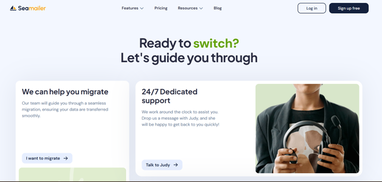
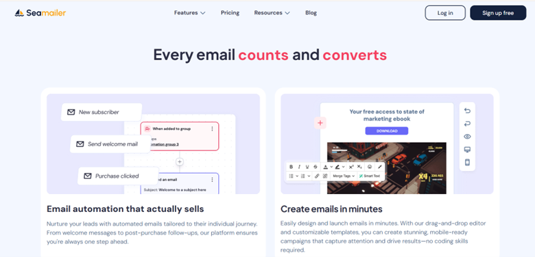
Seamailer
- What it offers: Drag-and-drop builder, automation, segmentation, analytics, and 99% deliverability. Built-in A/B testing and customizable CTA blocks.
- Pricing: Free plan (12,000 emails/month, unlimited contacts, with branding); paid plans from ~$7/month.
- Pros: Affordable, unlimited contacts, strong deliverability, simple UI, good for segmented CTAs, and frequent tests.
- Cons: Newer platform, fewer integrations, some advanced features still in rollout.
- Ease of use: Very easy.
- Ideal for: Startups, creators, and SMBs wanting high deliverability and flexible CTA testing at low cost.

Common CTA Mistakes (and How to Avoid Them)
Even experienced marketers sometimes sabotage their own CTAs without realizing it. Here’s a breakdown of frequent missteps — and how to turn each into a conversion opportunity:
| Mistake | Why It Fails | How to Fix It |
|---|---|---|
| Vague CTAs (e.g., “Submit”, “Click Here”) | Offers no clue about what happens next or why it matters. | Use specific, benefit-driven verbs like “Download Your Free Guide” or “Start Free Trial.” |
| Multiple CTAs Competing | Splits attention and confuses readers about which action to take. | Focus on one clear, primary CTA. Add only a subtle secondary option if absolutely necessary. |
| Weak Design (Button Blends In) | A CTA that visually disappears gets ignored. | Use contrasting colors, ample whitespace, and visual hierarchy to make it stand out. |
| No Context | A random button with no buildup feels out of place. | Build momentum with narrative copy that logically leads into your CTA. |
| Ignoring Mobile Layout | Buttons appear too small or cut off on smaller screens. | Design mobile-first, ensuring CTAs are tap-friendly and display properly on all devices. |
| Slow or Distracting Post-Click Page | Users lose interest if the landing page is slow or inconsistent with the email’s promise. | Make sure the landing page loads quickly and delivers exactly what was promised in the CTA. |
| Overusing Urgency or False Scarcity | Comes off as spammy and undermines credibility. | Use authentic urgency — only when real limits apply. Honesty builds long-term trust. |
Pro tip: The most effective CTAs are simple, relevant, and credible. When your readers know exactly what to do, what they’ll gain, and trust you’ll deliver — they click with confidence.
CTAs in Different Email Contexts (with Examples)
Your CTA should always match the intent and emotional state of the reader. A “Buy Now” button won’t work in a welcome email — and “Learn More” won’t drive urgency in a cart recovery campaign. Tailoring your CTA to context is what separates good email marketing from great.
Here’s how to align your CTAs with the purpose of each email type:
| Email Type | CTA Purpose | Example CTA |
|---|---|---|
| Welcome / Onboarding | Encourage new users to take their first meaningful action — setting up, exploring, or personalizing their experience. | “Get Started with Your Profile” / “Set Up Your Dashboard” |
| Educational / Value Email | Lead readers to deeper, helpful content that builds trust and authority. | “Read the Full Guide” / “Watch the Tutorial” |
| Product Announcement | Generate excitement around a new feature or launch and move users toward a trial or purchase. | “Try It Free Now” / “See the New Features” |
| Cart Abandonment | Reignite buying intent and help customers complete their purchase with minimal friction. | “Complete Your Order →” / “Return to Your Cart” |
| Re-engagement / Win-Back | Rekindle interest among inactive subscribers or lapsed users. | “See What’s New” / “Come Back & Claim Your Bonus” |
| Upsell / Cross-Sell | Encourage existing customers to upgrade or add complementary products/services. | “Upgrade & Save 20%” / “Add This to Your Plan” |
Tip: The most effective CTAs fit the reader’s stage in the journey. A good rule of thumb — early emails build trust (“Learn More”), mid-journey emails create action (“Start Free Trial”), and post-purchase emails deepen loyalty (“Refer a Friend”).
How to Test & Improve Your CTAs — A Practical Playbook
- Test one thing at a time. Change only a single variable per experiment — for example, the button text, color, placement, urgency phrase, or the small subline — so you know what moved the needle.
- Use A/B or multivariate tests. Run experiments on a holdout (typically 10–20% of your list) for a short, controlled window to get quick signals.
- Track the right metrics. Don’t just watch clicks — measure CTR, conversion rate, bounce rate, and revenue (or whatever your final KPI is).
- Roll out the winner. If the result is statistically meaningful, apply the winning variant to the remaining audience.
- Repeat and adapt. Winners age — what worked last month may underperform now. Keep iterating.
- Leverage dynamic CTAs. If your platform supports it, serve different CTAs to segments or by behavior (new users vs. power users, cart abandoners vs. browsers).
- Check the post-click experience. A great CTA only matters if the landing page delivers: ensure the page matches the promise, loads quickly, and minimizes friction.
Over time these small, thoughtful experiments compound: clearer copy, smarter placement, and better audience matching lead to steadily stronger results.

Sample CTA Variants (You Can Adapt These)
The smallest changes often deliver the biggest performance lifts. Here are some real-world CTA examples you can tailor to your campaigns and test for impact:
| Context | CTA Variant A | CTA Variant B |
|---|---|---|
| Lead Magnet | “Get My Free Guide” | “Download Your Free eBook →” |
| Webinar | “Reserve My Seat” | “Save My Seat for the Webinar” |
| Free Trial | “Start Free 14-Day Trial” | “Try It Free (No Card Needed)” |
| Sale / Promo | “Shop 30% Off Now” | “Claim Your Discount” |
| Content | “Read the Full Article” | “See All 10 Tips” |
| Feature Launch | “See It in Action” | “Explore the New Feature →” |
Pro Tip: When you test these, focus on micro-tweaks — verbs, urgency cues, and benefit phrasing. Those subtle shifts often outperform complete rewrites.
Putting It All Together: A Step-by-Step Email Flow
Here’s how to apply everything you’ve learned — from planning your email to optimizing your CTA for maximum impact.
- Identify Your Goal
Define what action you want readers to take — download, sign up, buy, register, etc. - Craft Body Copy That Leads Naturally to the CTA
Build curiosity, demonstrate value, and remove doubts before asking for action. - Design Your CTA for Visibility
Make it clear, high-contrast, and surrounded by whitespace. Test how it appears on mobile devices. - Combine Benefit + Verb + Optional Urgency
Example: “Get 20% Off Today” or “Start Your Free Trial – Ends Soon.” - Place CTAs Strategically
Include one mid-email (after building desire) and another at the bottom for scrollers. - Run A/B Tests on Small Variants
Compare subtle changes — button copy, size, color, or placement. - Track Clicks and Conversions
Monitor both pre-click (CTR) and post-click (landing page) performance. - Iterate and Scale What Works
Apply winning versions across future campaigns and keep refining.
Conclusion
Your CTA is the moment of truth in every email — where intention meets action. Even the most persuasive storytelling, design, or segmentation can fall flat if your CTA is weak, vague, or buried.
A strong CTA does more than invite a click — it inspires action by making the next step irresistible, obvious, and rewarding.
When you combine:
- clear, value-driven copy,
- visually distinct design,
- ongoing A/B testing, and
- behavioral insights from your platform,
…you create a system that consistently converts interest into results. Over time, those small CTR gains compound into meaningful revenue — and your CTAs evolve from simple buttons into strategic growth levers for your business.

